After-Images
| After looking at a bright light--such as a camera's flash or while driving into the sunset--you may continue to see an image of that object when you look away. This lingering visual impression is called an afterimage. |
| The sun's afterimage is usually a yellow circle... the same color as the sun. This is called a Positive Afterimage. |
| After a few seconds, the color of the afterimage becomes bluish... the complement of the sun's color... This is called a Negative Afterimage. |
| Here's a simple demonstration of a Negative Afterimage |
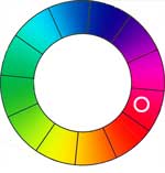
| Click on the red circle to the right and stare at the black dot for 20-30 seconds... try not to shift your gaze... you will soon see a little flickering around the edges of the circle, but, keep your eyes on the dot! After 20-30 seconds, shift your gaze to the white area to the right of the red circle... you should see a new circle... No?... try blinking your eyes. |
 |
| More negative afterimage demos. |
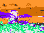
| The image to the right is a two-frame animation... stare at the red dot in the middle of the first frame... after 30 seconds, the image will change automatically... look at the red dot in the second frame |
 |
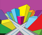
| The image to the right is also a two-frame animation... stare at the red star in the middle of the first frame... after 30 seconds, the image will change automatically... look at the red star in the second frame |
 |
| |
|
| |
|
McCollough Effect
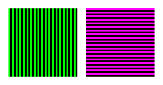
The McCollough effect is a contingent color aftereffect which can be seen on ordinary ruled white paper. Someone doing word-processing of green text on a black background — in the "good ole days" before full color came to computers — will afterwards see a sheet of ruled paper as slightly pinkish. The pink color disappears when the paper is turned sideways and reappears whenever the lines are horizontal. White chalk lines drawn horizontally on a blackboard will also appear pinkish—but only while the head is upright. The effect is therefore an illusion of color that is contingent on line orientation; it is an aftereffect of looking at colored lines with that same orientation; and its color is complementary to the color of those lines (Fig. 1).
If you don't see this, gaze at the colored grids for a while longer. This effect is not an afterimage based on fatigued neurons. Described by Celeste McCollough in a paper in Science magazine in 1965, it has been the focus of on-going investigation ever since.
- The intensity of this effect varies between individuals.
- The effect typically lasts for hours, and commonly overnight.
- The more that the subjects were tested, the shorter the duration of the effect
- In approximately half of the test subjects who were only tested once, it lasted 3 months.
- It is stronger in extroverts than introverts
- The duration can be changed by:
- The consumption of coffee and other psychoactive drugs — The duration decreases... the effect decays sooner
- Stress — Decrease... effect decays sooner
- Exercise — Decrease... effect decays sooner
- Fatigue — Increase... effect lasts longer
| Gaze at the two colored grids below... Do Not click on them yet! Stare for a few minutes (5 or so minutes is good... 10 is better). |
| There's no need to stare at a single point on a grid.Let your eyes wander on the squares |
| After several minutes, click on the grids, a black and white grid will appear. |
| You should notice a green haze around the horizontal lines, and a magenta haze around the vertical lines. |
 |
Or, you can try this Flash Application ... By clicking on this link, you can download and save the app. Double-click the file (In windows Explorer or Finder) to run it.

Simultaneous Contrast
Simultaneous contrast was first identified by chemist Michel Eugène Chevreul and it refers to the manner in which the colors of two different objects affect each other. Josef Albers, a Professor at the Bauhaus Design School in Germany and later the head of the Yale Department of Design authored Interaction of Color which presents a series of color exercises based on Chevreul's work.
Colors are affected by the colors around them. |
| In simultaneous contrast, the appearance of a color changes to look like the opposite of the neighboring color. Color "A" influences color "B" in the direction of the complement of color "A" and Color "B" influences color"A" in the direction of the complement of color "B." |
 |
| The larger one area of color is (A), the more it will affect the other color (B). |
 |
| To the right is an example of simultaneous contrast of values. |
 |
| Albers termed this value exercise "3 colors look like 4"... or simply 3=4 |
| Both small gray patches are the same gray. |
| The left gray looks lighter because it is surrounded by black and the opposite of black is white... so, white gets added to the gray, making the gray lighter. The opposite thing happens on the right side... the gray rectangle gets black added to it... because it is surrounded by white, and the opposite of white is black. |
| |
|
| The values of the two interior rectangles may be adjusted so that they appear the same... |
 |
| This is Albers' 4=3 exercise, using with values. |
Both small gray patches appear to be the same gray,
even though they are quite different.  |

| Hues are affected as well as values |
 |
| Any ground subtracts its own hue from colors which it carries and therefore influences. |
Red makes any color look like the opposite of red...
Red makes any color look like the complement of red...
Red makes gray look like cyan, because cyan is the complement of red.
The value of the gray is also affected. |
| To the right is an example of simultaneous contrast of values and hues. |
| Both small gray patches are the same gray. |
| |
| |
|
Albers' exercise, 4 colors look like 3... the small center rectangles are 2 different colors.  |
 |
Albers' exercise, 3 colors look like 2... the left center rectangle is the same color as the right center rectangle  but the left center rectangle looks like the right background but the left center rectangle looks like the right background  and the right center rectangle looks like the left background and the right center rectangle looks like the left background  . . |
 |
| |
|
| |
|
| |
|
| Generally speaking, the larger area of color makes the smaller area look like the opposite of the larger area. A large black area makes a smaller gray area look whiter. A large red area makes a smaller area look more cyan (The complement of red). |
|
Assignments
| Pick two objects that have "standard" "natural" "accepted" local colors... |
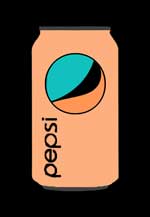
- For instance, a Pepsi can is red, white and blue
- LIGHTLY draw the can with pencil.
- Then paint it with the colors that are complementary to the red, white and blue.
- If you want, put a small dot in the center.
- Do the same with the second object on a second sheet of Bristol.
|
 |
| Do NOT do a smiley face |
 |
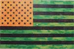
| Do NOT do any flags (Jasper Johns already did that back in the 1950's) |
 |
Both assignments are to be done on Bristol Board... each design is to be 6" x 6" or larger
![]()
