Color Schemes, Harmonies, Chords
Remember: if white is added to a hue, it's called a tint. If black is added, it's called a shade. Add gray (black + white), and it's called a tone.
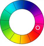
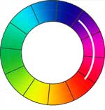
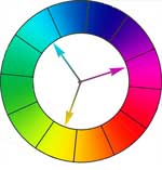
A Color Scheme is a planned combination of colors; these are also called color harmonies or color chords... and they consist of two or more colors with a fixed relationship on the color wheel.
Color schemes can be used in any kind of design or art, including painting, graphic design, interior design and web design. Color schemes are important to a successful design; they can help you control the viewers' emotional, as well as visual, reactions.
Traditionally, there are a number of color combinations that are considered especially useful in design.
Other color schemes include tint only color scheme; shade only color scheme; Tetrad color scheme (4 equally spaced colors); Neutral color scheme; Accented Neutral color scheme; Warm color scheme; Cool color scheme; and others.
Extras
Color Scheme Designer |
 |
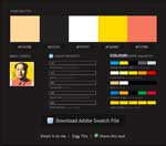
Pictaculous |
 |
Assignments
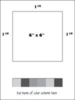
Note: All three Assignments are on 9x12" Bristol Board sheets. Each composition measures 6" square with a 1 1/2" border on all four sides. Below that is a pallet which measures 1" high, 3, 5 or 6" wide. Place the name of the color scheme below the palette.
Note: entire 6" square should be painted... any white areas of the composition should be painted with white paint and NOT just left blank.
Three free studies of color schemes. (You create the compositions.)
- Variety of color (minimum 10 areas with different color mixes)
- Interesting composition and use of color
- Neat presentation
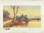
- Analogous Color Scheme composition / with pallet | Use three closley related hues. ( three or four closely neighboring hues on the color wheel). Make your design using these colors and any mixtures of the hues plus their tints and shades. The pallet should have the three or four different colors that you used as well as plain white and black (5 - 6 color chips total).
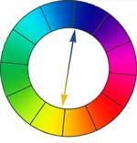
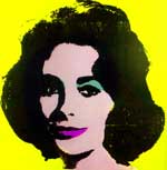
- Complementary or Split Complementary Color Scheme composition / with pallet | Use ONLY the two complements and their mixtures, plus white (NO black). For the pallet, paint the two complements on the outside squares. The middle square should be a neutral gray mixed from these two colors. (3 color chips total).
OR
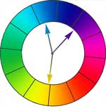
use a hue plus its two split-complementary hues and their mixtures, plus white (NO black). The design can include any mixtures of the two complements as well as white (not black). For the pallet, paint the three hues used. (3 color chips total).
- Triad Color Scheme composition / with pallet | Use only three equally spaced hues plus their tints and shades. Do not intermix the three hues, except with black or white.The pallet should include the three hues in your chosen triad as well as plain white and black (5 color chips total).


