VALUE
Value is the lightness or darkness of an area.
Value is a relative term… One area can be lighter than another,
yet it can be darker than still another. This is easy to see with grays.
| The left shape below is lighter than the center shape… and they're both darker than the shape on the right. | ||
 |
 |
 |
| Colors have value also. | ||
 |
 |
 |
Different individuals can differentiate different gradations of gray between black and white. If you can see the difference between patches 1,2 and 3... you can differentiate at least 20 values. If you can see the difference between patches 3 and 4... you can differentiate at least 33 values. 4 & 5... you can differentiate about 100 values. |
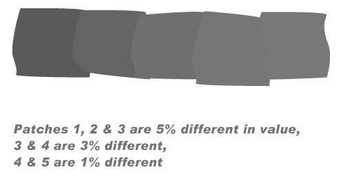 |
| Most computers are able to show 256 different values... from white to black. Since this is a greater number of values than most people can differentiate, a smooth gray area can be represented. |  |
| Artists and designers use value to differentiate areas of a composition. | |
|
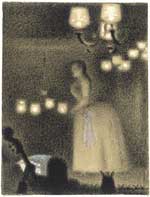
Georges Seurat |
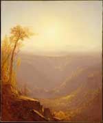
Sanford Robinson Gifford |
Local Value refers to the natural lightness/darkness of something independent of any lighting conditions. A piece of Bristol board has a local value of almost white… even though it may be in a dark room. |
|
High Key
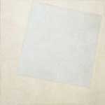
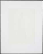
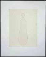
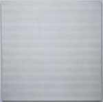
High Key refers to images where most of the values are light.
Kazimir Malevich
White on WhiteWilliam Trost
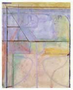
Franconia Notch, NHRichard Diebenkorn
Ocean ParkJosiah McElheny
Josiah McElheny
Contrast artificially addedAgnes Martin
The Tree
“Art no longer cares to serve the state and religion, it no longer wishes to illustrate the history of manners, it wants to have nothing further to do with the object, and believes that it can exist, in and for itself, without 'things'.”
~Kasimir Malevich
Low Key
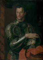
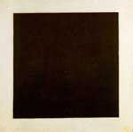
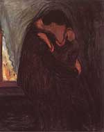
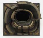
Low Key refers to images where most of the values are dark.
Workshop of Bronzino
Cosimo-I-de'-MediciKazimir Malevich
Black SquareEdvard Munch
The KissLee Bontecue
Untitled
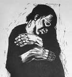
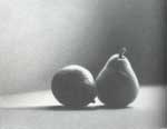
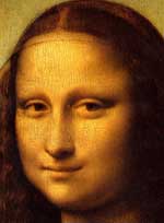
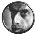
Sharp Contrast and Gradation
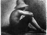
Contrast of value separates objects in space. Georges Seurat
Sitting Boy with Straw HatKathe Kollwitz
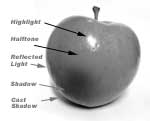
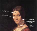
The WidowGradation of value suggests mass and contour of a continuous surface. Martha Alf
PearsLeonardo da Vinci
Mona Lisa, DetailM.C. Escher
Self Portrait
Chiaroscuro and Tenebrism
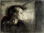
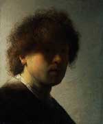
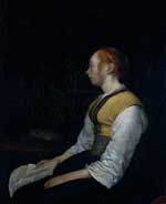
Chiaroscuro is the use of strong contrasts between light and dark. Chiaroscuro often refers to the modeling of forms using only value without any lines outlining the forms. Edvard Munch
The Sick Girl
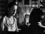
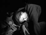
Film Noir
"Out of the Past"
Directed by Jacques Tourneur, starring Robert Mitchum, Jane Greer, and Kirk DouglasRembrandt was twenty-two years old when he painted this self-portrait.
Gerard ter Borsch
Girl in Peasant CostumeArtemisia Gentilesch
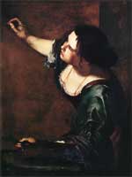
Self Portrait
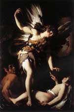
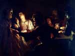
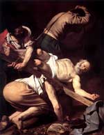
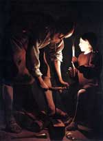
Tenebrism is a style of painting using very pronounced chiaroscuro, where there are violent contrasts of light and dark, and darkness becomes a dominating feature of the image. ~http://en.wikipedia.org/wiki/Tenebrism
Often the light source is within a tenebrist artwork.Film Noir
"Out of the Past"Giovanni Baglione
Sacred and Profane LoveGerrit van Honthorst
The Denial of St. PeterCarravagio
Crucifixion of St. peterGeorges de la Tour
The CarpenterGerard Dou
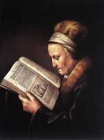
Old Woman Reading
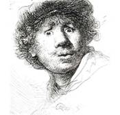
Value is an especially important element in works of art when color is absent. Rembrandt
Self Portrait
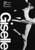
Armen Hofmann
Poster
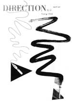
Dark values usually attract attention and overpower lighter values, even if the lighter areas are larger. Paul Rand
Cover Illustration
Gradations of value attract more attention than flat areas. Pablo Picasso
Andrey VolkovThe eyes start with the strong contrast in value, black and white, then white, then grays.
Value Assignments
Painted Gray Scale |
|
| For this exercise, use only black and white paints. | |
| OR, if you are using transparent watercolors, use only black paint! | 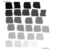 |
You’re going to paint oversized patches of gray and then cut them to size. It is easiest to paint larger |
|
.
- Pour a small amount of white paint onto your palette or into a mixing cup.
- Paint a patch (approximately 2” x 2”) of pure white paint on your Bristol board.
- Add a little black to the white in the cup, creating a very light gray.
- Paint a 2” x 2” patch of this gray onto the Bristol board. Apply the paint evenly for a flat, no-strokes-showing effect.
- Repeat steps 3 & 4, each time making a slightly darker gray until you have reached pure black (paint at least 20 patches)
- Let the paint dry.
- Roughly cut out the patches.
- Cut one edge straight.
- Pick the nine best grays by overlapping patches.
- Cut these nine grays… plus pure black and pure white, to a final-sized rectangle of ¾” x 1 ½”
- Glue these eleven rectangles onto a new piece of Bristol board with their edges touching…


-
no white between them
-
no overlapping
-
Keep the glue off the paint!
-
Neatness counts!
Value Composition
On a 9 x 12 Bristol, using values of Gray, create a Unified, Varied, Balanced Compostion as follows:
- Draw two lines with two different angles (somewhat horizontally) across the bristol paper.
- Then draw one, somewhat vertical line.
- Then draw a curving, looping, moving irregular line that starts at the left edge and finishes to the right.
- Then draw a curving, looping, moving irregular line that starts at the top edge and finishes to the bottom.
- If you have fewer than 15 shapes at this point, add another line.
- In each shape, create a solid value
- a maximum of 3 paper-white areas left blank/unpainted.
- no two adjacent areas may have the same value.
- USE VALUES to balance the composition
Homework

