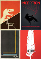
POSTER
Keep Message Obvious
Posters should be designed to convey one message, and not several messages. If you've got too much to say, you've got to cut it down so that you're not overloading the viewer with information and so that your message can readily be understood. This message must be obvious; viewers aren't going to waste time trying to figure out what your poster means, so your point has to leap from the page.
Keep It Visual
A poster is a visual medium, so don't put too much writing on it; the visual effect of the poster should speak for itself, and the message of the poster shouldn't need explaining. A poster requires very concise visual storytelling in a limited space, and that story needs to begin and end on the poster and not leave viewers asking for explanations. Remember to include any important information, such as contact details, in a visible position. For example a related website, email address, P.O. Box, etc.
Grab Attention
There's no point putting together a poster that no one is going to look at. Whatever your poster is about, it needs to catch the attention of the intended audience. In some cases, this might require a striking piece of your own graphic/visual art; while in others, simply displaying a particular message in large print may do the job. Frequently, it will be a combination of these.
Readability
Font size Guidelines for an 11" x 17" poster:
Major text: 72 points minimum
body text: 18 points
Color
Don't be tempted to use too many colors, since this will frequently confuse onlookers and prove distracting.
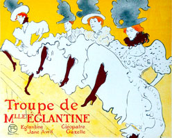
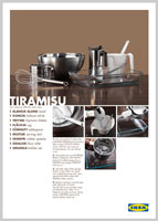
Poster Samples


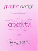
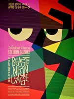
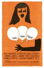


_1891.jpg)
